

What is MUI Rating?
The Rating component in MUI enables users to select a rating value visually. It supports customization, precision adjustments, and interactive feedback.
How to Implement MUI Rating in React
To use the Rating component, first install Material-UI in your React project:
npm install @mui/material @emotion/react @emotion/styled
Basic rating
The rating can display any float number with the value prop. Use the precision prop to define the minimum increment value change allowed.
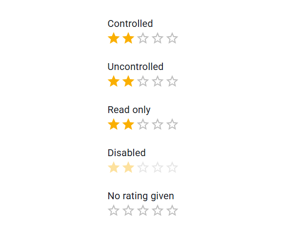
Code:
<Rating name="half-rating" defaultValue={2.5} precision={0.5} />
<Rating name="half-rating-read" defaultValue={2.5} precision={0.5} readOnly />
Customization
Here are some examples of customizing the component. You can learn more about this in the overrides documentation page.
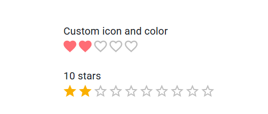
<Typography component="legend">Custom icon and color</Typography>
<StyledRating
  name="customized-color"
  defaultValue={2}
  getLabelText={(value: number) => `${value} Heart${value !== 1 ? 's' : ''}`}
  precision={0.5}
  icon={<FavoriteIcon fontSize="inherit" />}
  emptyIcon={<FavoriteBorderIcon fontSize="inherit" />}
/>
<Typography component="legend">10 stars</Typography>
<Rating name="customized-10" defaultValue={2} max={10} />
Radio group
The rating is implemented with a radio group, set highlightSelectedOnly to restore the natural behavior.
The rating is implemented with a radio group, set highlightSelectedOnly to restore the natural behavior.

<StyledRating
  name="highlight-selected-only"
  defaultValue={2}
  IconContainerComponent={IconContainer}
  getLabelText={(value: number) => customIcons[value].label}
  highlightSelectedOnly
/>
Understanding MUI Rating: A Guide for Developers
Material-UI (MUI) provides a Rating component that allows users to give feedback using stars or other symbols. This component is widely used in applications for reviews, rankings, and user feedback.
What is MUI Rating?
The Rating component in MUI enables users to select a rating value visually. It supports customization, precision adjustments, and interactive feedback.
How to Implement MUI Rating in React
To use the Rating component, first install Material-UI in your React project:
npm install @mui/material @emotion/react @emotion/styled
Then, import and use the Rating component:
import React, { useState } from "react";
import { Rating } from "@mui/material";

const MyRating = () => {
  const [value, setValue] = useState(2);

  return (
    <Rating
      name="user-rating"
      value={value}
      onChange={(event, newValue) => setValue(newValue)}
    />
  );
};

export default MyRating;
This example creates a simple rating system where users can select a rating, and the state updates accordingly.
Customizing the Rating Component
MUI allows customization of the Rating component using props like precision, size, and icon.
- Precision – Allows fractional ratings (e.g., 2.5 stars).
- Size – Adjusts the size of the rating icons.
- Custom Icons – Replace stars with other symbols like hearts or thumbs-up.
Conclusion
The MUI Rating component is a great way to collect user feedback in a visually appealing manner. With its customization options, developers can tailor it to fit their application's needs.
For more details, check out the official MUI Rating documentation or explore community discussions on Stack Overflow. Let me know if you need help implementing it! ?