
Imagine you're working as a developer, and a designer colleague hands you a design for a brand new website. The design has all sorts of interesting layouts and compositions: two-dimensional layouts that are considerate of viewport width and height, as well as layouts that need to be fluid and flexible. How do you decide the best way to style these with CSS?
CSS provides us with various ways to solve layout problems, on a horizontal axis, vertical axis, or even both. Choosing the right layout method for a context can be hard, and often you may need more than one layout method to solve your problem.
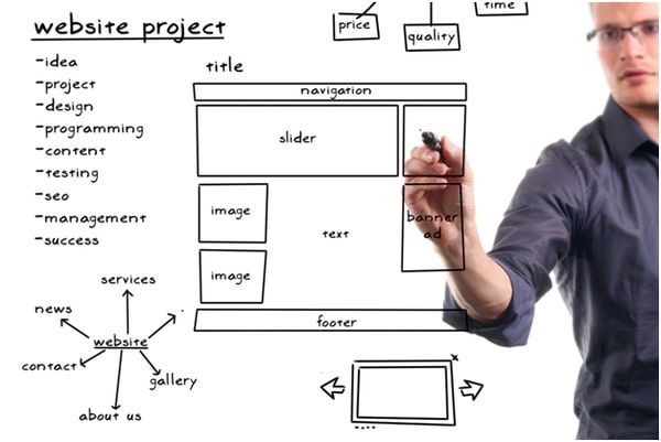
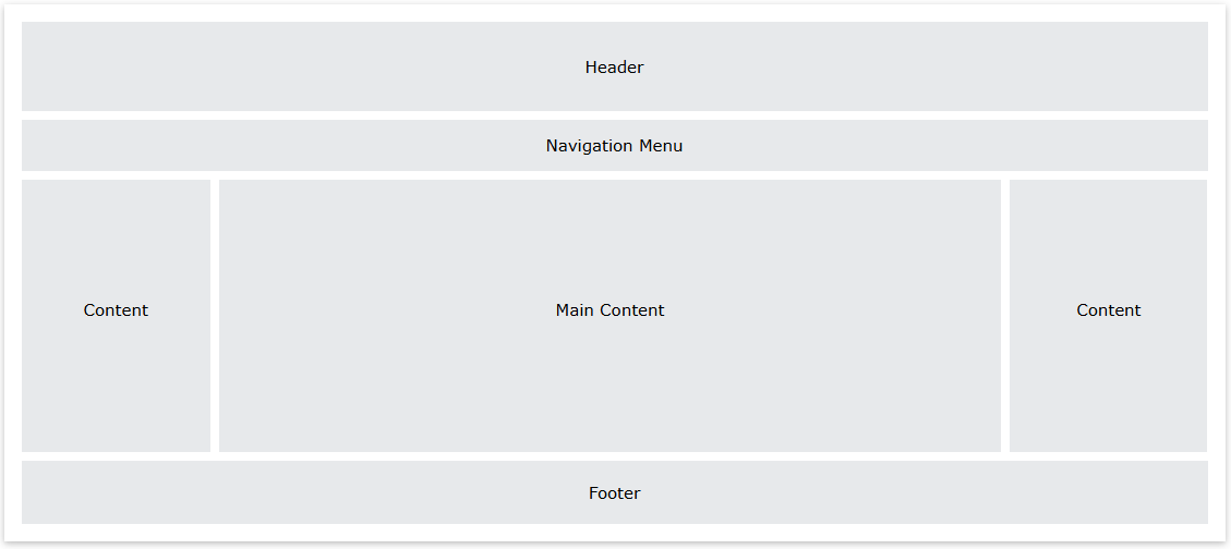
Creating a website layout with CSS involves structuring different sections like the header, navigation bar, content area, and footer.
Common Website Layout Structure
1/ Header: Contains the site logo and navigation.
2/ Navigation Bar: Links to different pages.
3/ Main Content: The core information of the site.
4/ Footer: Includes copyright, contact info, etc.
We will go example detail each component as bellow:
1. Header
<head>
      <style>
          .header {
              background-color: green;
              padding: 15px;
              text-align: center;
          }
          .header h2 {
              color: white;
              margin: 0;
          }
      </style>
</head>
- The <div class="header"> element defines the header section of the webpage.
- The .header CSS class styles the header with a green background, 15 pixels of padding, and centers the text.
2. Navigation Menu
<body>
    <div class="nav_menu">
        <a href="#">Algo</a>
        <a href="#">DS</a>
        <a href="#">Language</a>
    </div>
</body>
- The .nav_menu class defines the style of the navigation menu with a dark background and ensures the links are aligned horizontally.
- The a tag inside .nav_menu defines each link's style, including white text and padding for spacing
3. Content
<style>
    .columnA,
    .columnB,
    .columnC {
        text-align: center;
        color: green;
    }
</style>
- The HTML structure defines three content sections, each inside a <div>, which can be further styled or adjusted as needed for responsive layouts.
- The .columnA, .columnB, and .columnC classes style the content areas, aligning the text to the center and coloring it green.
4. Footer
<style>
    .footer {
        background-color: green;
        padding: 15px;
        text-align: center;
    }
</style>
- The .footer class defines the footer section, giving it a green background, padding, and centering the text.
- Inside the footer, there are links for "About," "Career," and "Contact Us," which provide quick access to those sections.
Conclusion
Creating a structured CSS website layout is essential for building a visually appealing and user-friendly site. By using flexbox and grid, you can efficiently arrange elements, while media queries ensure responsiveness across different devices. A well-organized layout improves usability, enhances aesthetics, and optimizes performance.
To achieve a great layout:
- Utilize semantic HTML for better readability and SEO.
- Apply flexbox and grid for effective element alignment.
- Ensure responsiveness with media queries.
- Keep the design clean and intuitive for a seamless user experience.
Mastering CSS layout techniques allows you to create professional and adaptable websites that cater to various users and screen sizes. Keep experimenting and refining your approach to achieve the best results.